What’s Behind Eye of the Day’s Logo?
DAISY. DAY’S EYE. EYE OF THE DAY.
When Brent and I began daydreaming about a name for our business, our daughter Daisy was seven and our lives revolved around her (THAT hasn’t changed). We wanted to incorporate “Daisy” into the name and decided to go for the old English meaning: Day’s Eye, for the resemblance of the flower to a stylized sun. And as Daisy was the eye of our lives, Eye of the Day was born.
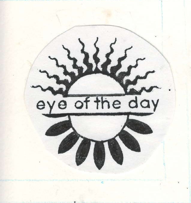
An overnight with our best friends, Robin, Cassidy and Heidi, found us talking about a logo for Eye of the Day. The evening grew late as we sipped our wine and played with ideas and soon graphic designer Robin had come up with a circular logo featuring the top half as a sun and the lower half as a daisy, split horizontally in the middle with the words “Eye of the Day” bisecting the halves. Without question, this was perfect for us.
Our logo has undergone a few changes in the past seventeen years; a few different graphic designers have tweaked it here and there. The newest evolution is used on our Look Book, embossed on the cover and on the back and graces our new business cards as well. In fact, we are using it everywhere! We started our new business with a basic, interesting design and over time it has morphed into a more complex mixture of words and graphics, but its simple and meaningful heart remains true: the eye of the day still remains our Day’s Eye.